Across artforms, the norms of narrative design are soaking in ideas that hold up a monoculture and deny the personal. The two work hand in hand. Processes encourage the idea of one way of making, one structure, as being better than all, and that way of making is always defined by someone else. This is echoed in the siloing of elements of a project and roles. One part of a project is more important than the rest. So what are the ways we can intervene with these big cultural ideas in our everyday processes? What are the ways we can encourage multiplicity and the self in our narrative design? Today I’ll share a method I’ve found helpful: the Design Cross-Section. It has a background in the Journey Chart.
The Journey Chart
The Journey Chart is to me an overview of the different elements of a project juxtaposed to show how they work together over the duration of the player/audience/reader experience. I’m sharing the Journey Chart Method because I’ve found it to be a nifty way to externalise, discover, inspire, unify, direct, and communicate the various elements of a project and how they are all connected. You probably already do it.
Indeed, you may not know it as a Journey Chart. It has been called a Tension Chart. (I personally don’t like the emphasis on the player/audience feeling tense). It has been called a Game Progression document. (I personally want a term that can work in games and films, books, etc, and try to avoid invoking ideas of “progress” which has it’s own serious problems). In marketing and product design it as been called a Customer Journey. (But I’m avoiding all framing of people as customers.) But you call it what works for you.
Personally I came to this method through the cross-media context. It is something I have been doing to depict what my player or audience all along the way before and after the game/website/book/film/etc. For me it started I think with ARGs (alternate reality games), including the chart Michael Monello shared for The Legend of the Sacred Urn, made 2003/4. The employment of this chart, which they called “The Unified Theory Chart,” was a promotional campaign. I mention this because the method has been most popular in service design and marketing. Indeed, in their literature review of “customer journeys,” which is what they’re called now, Asbjørn Følstad and Knut Kvale propose a few historical beginnings.
They point to Parker and Heapy’s 2006 pamphlet The Journey to the Interface as sparking interest in the field of design. In service management, they point to studies by Zomerdijk and Voss in 2007, 2010, 2010. And in marketing they point to various sources, including Buttle in 2003, Court in 2009, and Lee in 2010. For myself, I had the documentation of branded ARG context, and working with “user journeys” when I mentored at the Australian Film, Television and Radio School lab in 2005 onwards. But as I said, these are the journey across media, or touch-points.
What I’m talking about today is depicting the elements within the work. It is less about the story of one person travelling through, as has been criticised as the limits of the “journey chart” in design. It is more about the elements that make up part of the design.
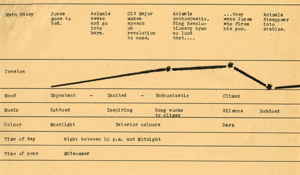
The earliest example of this approach I’ve found so far is from the 1954 animated feature film Animal Farm. It was called a “tension chart” and is stored in The Halas & Batchelor Collection, BFI Special Collections. It is a chart that shows the emotional journey of the story (the tension), along with some of the elements that contribute to the overall experience. Placing them side-by-side (horizontally), the visualisation gives us an insight into how they work together and change.
In the section of the yellow paper chart below, from this page, the main story beats are typed in the first top row. Then the tension depicted as marks and a line indicating less and higher tension as the scenes progress. Then there are the associated Moods, Music, Colour, Time of Day, and Time of Year rows. More parts to the chart are on this page. So with this chart there are the narrative beats, the emotional journey, and what everyone will be aiming for in terms of mood, and how the music and colours will assist with that. What I like is that is gives really quickly and easily, with some words and scribbles on a page, an idea of how the experience will move, and how all the elements will work together to do it.
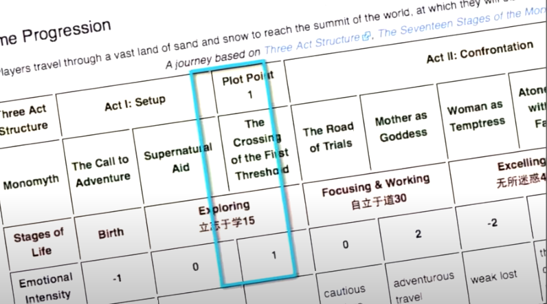
Zip along to a relatively recently with the 2009 Journey videogame, and Jenova Chen’s “game progression” chart. From the images Chen shared in this GDC talk, we can see the rows are written out with the three-act structure on the top row, the stages of the monomyth (hero’s journey) on the second, then stages of life, numbers to indicate emotional intensity (-1,0,1,0,2,-2), and the next row(s) are cut off from view.
What I like about this is the layering of two dramatic structure rows: the underlying structure, and then the monomyth structure. The Hero’s Journey is unsurprising, as it is the most well-known narrative structure beyond the Three Act Structure (which is often attributed to Aristotle, who is quite light touch and actually had four acts). Then there are Stages of Life, listed as Birth, Exploring, focusing & Working, Excelling… I am unfamiliar with these, and so if you know this specific structure let me know. But the point is, the creatives involved, I presume mainly Chen, is layering in what he thinks is important. Just like the Animal Farm chart discussed previously included time of day and seasons, you can include whatever is part of your creative mix. The section on Emotional Intensity is once again a guide to want we’re aiming for regarding the player/audience.
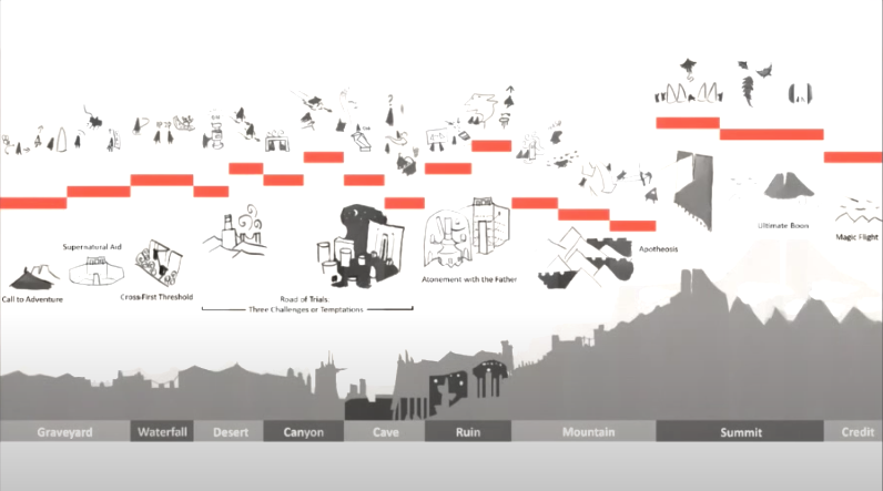
The team also developed illustrated versions. Below is an illustration that has the game avatars moving in relation to objects on the top row. This is the gameplay visually represented. Then emotional intensity is depicted with orange bars moving up and down (with the gameplay figures moving up and down with them). The next row has the monomyth/hero’s journey is depicted with small illustrations. The next row after that depicts the landscape as a silhouette; and underneath are labels for the environments/levels, such as “Graveyard” and “Desert”. So what players do, the settings, the emotional journey, and narrative logic of the situations are depicted together.
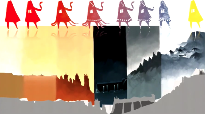
Another chart depicts character growth on the top row with the avatar shape and colours changing. Then mood and palette is communicated with saturated colours over the bottom of the landscape silhouette again with more detail.
What these documentation methods are doing is bringing various elements together, and including whatever the creatives find helpful as guiding structures and elements.
What To Include In Design Cross-Section?
As you’ve seen with these two examples, you can include what has been a part of your mix. What I do and encourage others to do, to help normalise multiplicity and the self, are these things:
- Include multiple narrative structures. As anyone who has worked in storytelling for a while knows, you don’t just employ one structure (example: the three-act structure).
- You’ve got your underlying dramatic structure. That may be the three-act structure, five-act structure, eight-act structure, etc.
- You’ve got further structures like the monomyth, such as the heroine’s journey, the virgin’s journey, and more.
- You’ve got your genre structures. Each narrative genre has a structure, or at least conventions, obligatory scenes, or elements.
- You’ve got your subgenres, and maybe internal genres too.
- As applicable, include mechanics/interactions & game elements. These are genre-specific too, and can have elements that you’ve generated too. Mechanics and narrative structures work together. Susan O’Connor has a great article summarising how they work together. I call the processing of bringing all these elements together grafting.
- Include settings, levels, zones, as applicable.
- Include Actual World structures and elements. Perhaps you’re drawing on the Stages of Grief for instance?
- Include structures and elements from your own Lived Experience. What was your journey like for yourself? What have you observed in yourself and in others? Your lived experience and observations are just as valid as any other elements.
- Include sound design, music, art, time, fonts, whatever you damn well please!
So it’s not ONE STRUCTURE, it’s not ONE ELEMENT, it’s not ONE DEPARTMENT, and it also INCLUDES YOU.
I offered the Design Cross-Section as an optional method with my interactive storytelling students this year and the ones that came back were so fascinating. Some included images and music links as references, sprite changes, and more. For many, they suddenly saw how the various roles on the team were coming together. It became a spreadsheet they all referenced and added to.
So this, and the fact that the method enables multiplicity and including the self, is what inspired me to share this method. I’ve found it helps some others and so it may be interesting for you.
Enjoy! And please do share any of your own examples or experiences or ideas you have about this!
References (some)
Buttle, F. (2003), Customer Relationship Management: Concepts and Tools, Butterworth-Heinemann, Burlington, MA.
Court, D., Elzinga, D., Mulder, S. and Vetvik, O.J. (2009), “The consumer decision journey”, McMinsey Quarterly, June, available at: www.mckinsey.com/insights/marketing_sales/the_consumer_ decision_journey (accessed November 1, 2014).
Følstad, A. and K. Kvale. “Customer journeys: a systematic literature review.” Journal of Service Theory and Practice 28 (2018): 196-227.
Lee, G. (2010), “Death of ‘last click wins’: media attribution and the expanding use of media data”, Journal of Direct, Data and Digital Marketing Practice, Vol. 12 No. 1, pp. 16-26.
Zomerdijk, L. and Voss, C. (2007), “Innovation in experiential services – an empirical view”, in DTI (Ed.), Innovation in Services, DTI, London, pp. 97-134.
Zomerdijk, L.G. and Voss, C.A. (2010), “Service design for experience-centric services”, Journal of Service Research, Vol. 13 No. 1, pp. 67-82.
Zomerdijk, L.G. and Voss, C.A. (2011), “NSD processes and practices in experiential services”, Journal of Product Innovation Management, Vol. 28 No. 1, pp. 63-80.
Love this! Thanks for sharing.
Oh yay – great to hear – thank you letting me know!
Really interesting, so adding & visualizing more things about the context to journey mapping.
Yeah, it is about having multiple structural designs and elements you’re drawing from and seeing how they work in juxtaposition (as a temporary state). I’m trying to think of another term other than journey chart bc of the associations & issues there.
Super excited to see how it eventually turns out, looks like.